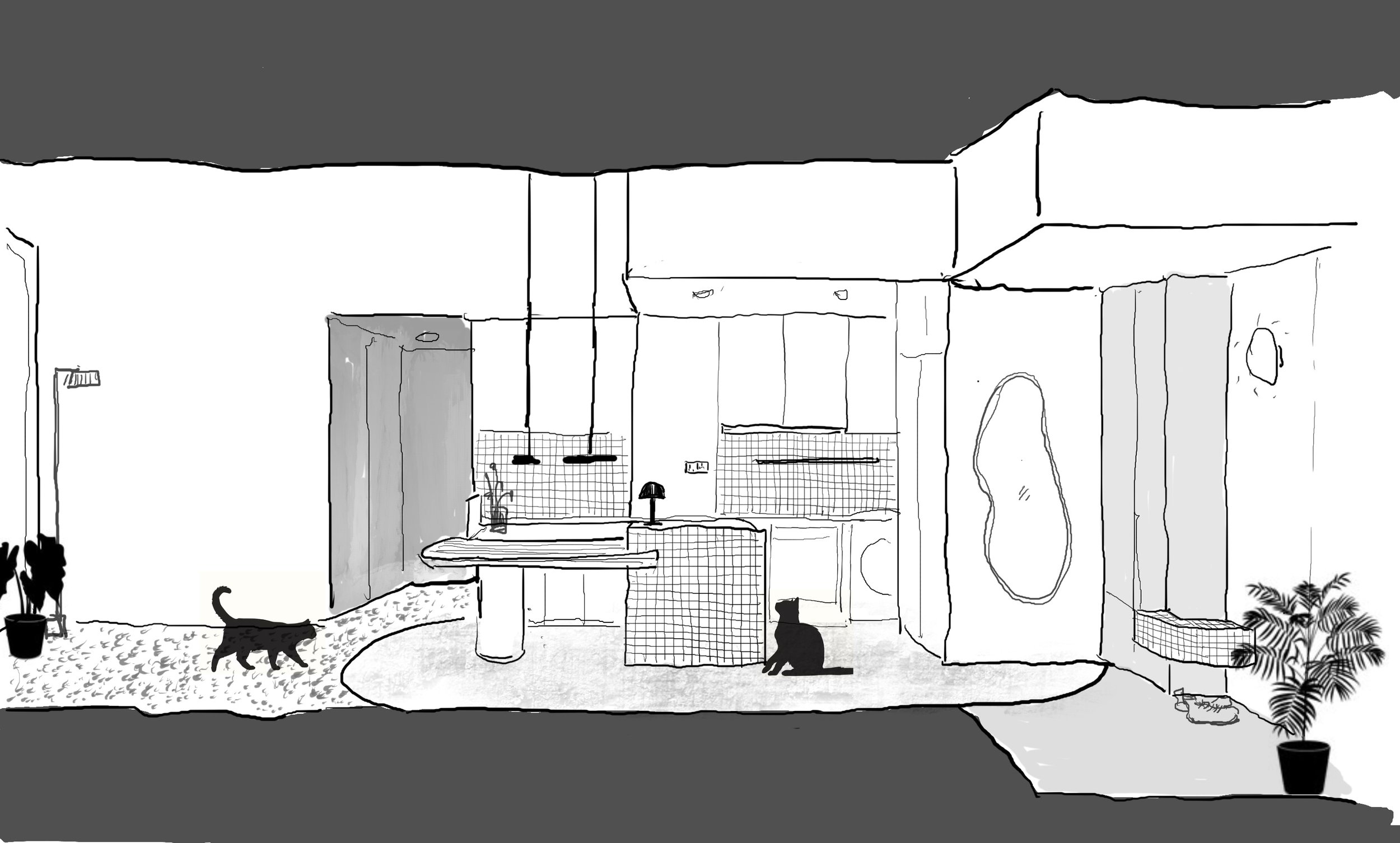
The client’s brief was simple: a wish to turn the enclosed kitchen into an open one with integrated dining space, the use of pink and gold, and a fengshui recommendation to incorporate curves and have clear separation of spaces. These simple but sometimes conflicting requirements became a framework for playful exploration on how colour and texture can be used in different moments—serving as accents in some, and as backdrops at others.
Minimal demolition was carried out to reconfigure the layout. The previously enclosed kitchen and yard were opened up, creating a continuous space incorporating the living room, dining area, kitchen and a utility space that shares the same counter span as the stovetop. The master bedroom’s entranceway was brought forward, requisitioning the adjacent bedroom for a walk-in wardrobe. The bedroom nearest the main living area was converted into a study, with the flexibility for accommodating guests. Two existing bathrooms—one common, and one master ensuite—were kept intact. While the rooms and the balcony had doors to serve as physical separation, the main living area with its newly freed kitchen posed more of a challenge. To maintain both the fengshui and a sense of open fluidity, we introduced microcement flooring in three colours, differentiating the various zones in soft sweeping arcs.
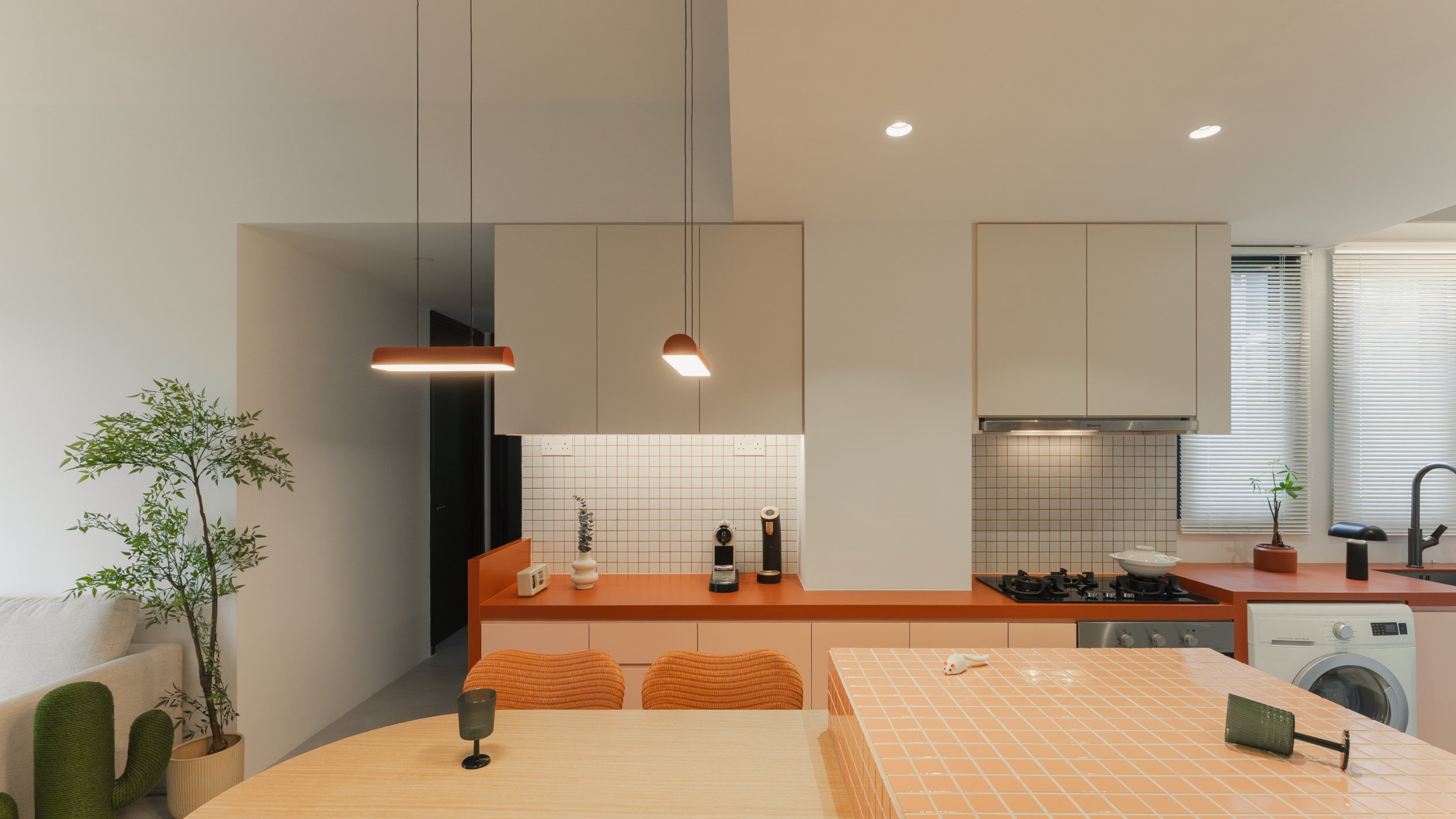
The selection of floor colours established a literal base for us to build complimentary colour palettes for each zone. The foyer’s light pink floor holds a set of full-height, taupe cabinets, which intersect a curved bench in beige tile. Moving into the kitchen zone, the microcement floor transitions into a soft beige. In pride of place is the kitchen island finished in pink tile—additional counter space for the kitchen behind, and a convenient surface for cats to perch. The dining table intersects the island, repeating the playful gesture of the foyer bench, with the curved end gently approaching the living area. Abutting the kitchen wall, a continuous plane draws out the kitchen and utility worktop. The burnt cinnamon hue of the surface seeps upwards into the grout of the kitchen backsplash, terminating at a row of off-white upper cabinets.
In the living area, light grey flooring anchors brown-toned soft furnishings, and a TV console in light wood, with a circular cutout that creates space for quick cat naps. The neutral palette enhances and gives center stage to the generous daylight pouring in from a set of full-length, full-width sliding doors which lead to the small balcony. By borrowing light as well from the windows above the kitchen and utility area, the main space is kept bright and airy, using light and depth to create cohesion between the tonal differences of the individual zones.
Moving in sequence, from foyer to kitchen and dining, through the living area, and into the study and bedroom, the colour palette gradually transitions into warm neutrals. The walk-in wardrobe is finished in a softer touch, with light woods and fluted glass doors detailed with curves of gold. Here in the bed area, darker tones create a more restful ambience. The walls are painted in a beige limewash, onto which a fluted wooden headboard is layered and featured. One of the client’s requisite colours, pink, is introduced here in a dusty shade via the curtains.
The built-in carpentry and material finishes only gave us further opportunities for inviting playfulness. We used mosaic tiles of similar sizes in different colours, to clad the foyer bench, kitchen island and backsplash. Fluted textures of varying extrusions form the TV console, the doors and shelf backings within the walk-in wardrobe, and the bedroom headboard. These flutes area further echoed in the rippling of curtains when drawn open, and referenced through the blind slats for the secondary windows. These groupings of textures create small instances of familiarity as you move through the fluid colours of the house, forming different combinations through a simple series of gestures. So while the apartment is a simple brief, a layered approach transforms it into a varied intersection of geometries, contexts and hues. Living here is a seamless movement with distinct moments of pause, amidst a calm backdrop that gives rise to playful occasions of colour.
ID | DUSTY PINK ABODE
TYPE: 4-Room Apartment (904 sqft)
STATUS: Completed 2024
SCOPE: Interior Design
CLIENT: Private, Singapore
BRIEF: Open Kitchen but with clear demarcation of different zones, shades of pink within the house
PHOTOGRAPHER: Ong Chan Hao
FLOOR PLAN
MATERIAL PALETTE
BEFORE
AFTER


